Field Probes |
EMA3D can generate 2D plots automatically for point, boxed region, and distributed field probe data from the EMA3D Simulation (Section 1). Users can also export the data as a data file or image (Section 2).
Plots can be generated during or after a simulation. If generated during a simulation, users should right click on the generated plot and select Refresh from the pop-up menu to update the time domain plots with newer data. Users should follow the steps to compute statistics from the beginning, as refresh will not work in those cases.
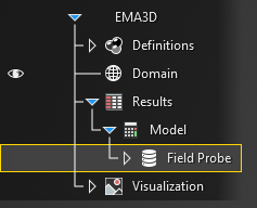
After the simulation has finished or the results have been imported, navigate to the Simulation Tree. Expand the results within the Results node. Right click on Field Probe. Several options will appear including options to rename the probe data within the Simulation Tree, delete the probe data from the Simulation Tree, compute field statistics (Shielding Effectiveness and E-field minimum, maximum, and mean), compute averages (E-field minimum, maximum, and mean only), plot the raw E-field data at each probed point vs time, and navigate to the data file.
Choose the desired plotting tool.
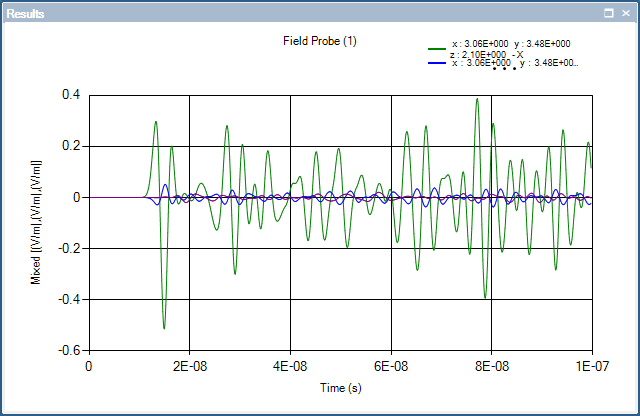
Selecting Plot will plot the raw vector E-field data at each probed point vs time. This option is not recommended for large boxed region probes, as there are 3 line plots per probed point, which can take a long time to render and is difficult to read. This plotting tool works best with point probes.
Selecting
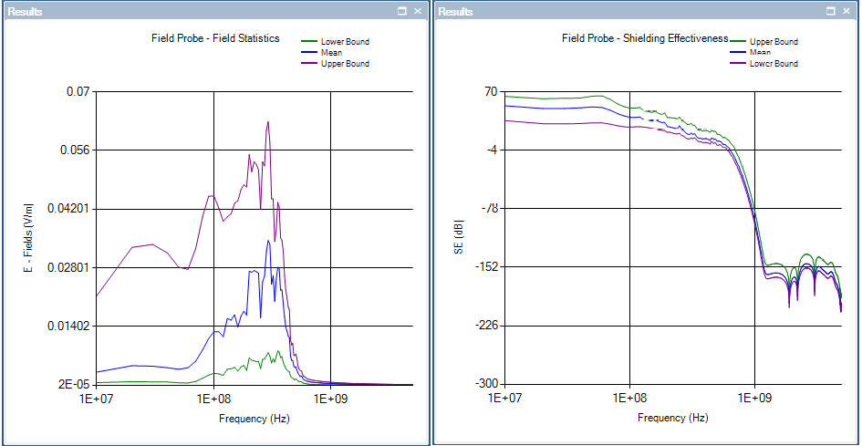
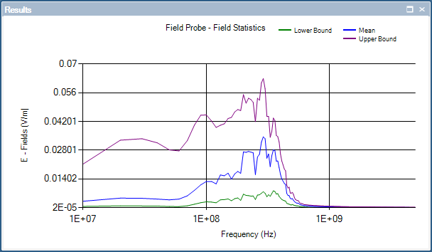
 Compute Field Statistics will compute and plot 2 plots. First, it will compute and graph an E-field vs Frequency plot at the point probe location / within the boxed region probe. Second, it will compute and graph a Shielding Effectiveness vs Frequency plot at the point probe location / within the boxed region probe. If the probe is a boxed region probe, both plots will include a mean, maximum, and minimum line calculated from all the data in the boxed region.
Selecting
Compute Field Averages will compute and graph only an E-field vs Frequency plot at the point probe location / within the boxed region probe for instances when Shielding Effectiveness is inappropriate. If the probe is a boxed region probe, the plot will include a mean, maximum, and minimum line calculated from all the data in the boxed region.
If selecting Plot or
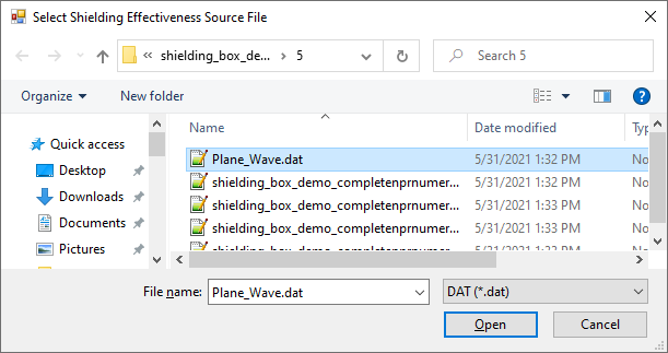
Compute Field Averages, skip to the next step. Selecting Compute Field Statistics will trigger a pop-up window. Within the window, choose the file containing the source file data (e.g., Plane_Wave.dat if a plane wave was the excitation source). Note that for simulations with subgrids, the source file may be in the Sub_grid folder.
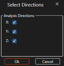
A pop-up window will appear to select the desired vectors along which to analyze the data (X, Y, and/or Z). Click the checkboxes next to the desired options and select OK.
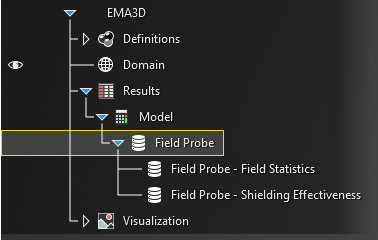
The plot(s) will show up within the Visualization node in the Simulation Tree. The E-field vs time plot will be named simply [Field Probe Name]. The E-field vs Frequency plot will be named [Field Probe Name] - Field Statistics. The Shielding Effectiveness vs Frequency plot will be named [Field Probe Name] - Shielding Effectiveness.
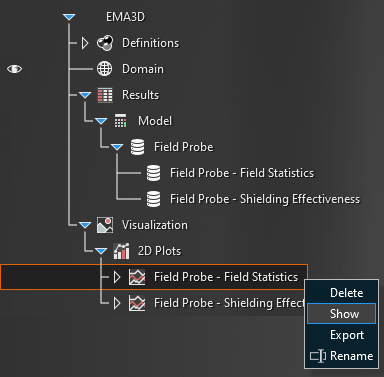
Right click on one of the field probe plots and select
 Show in the pop-up window.
A new window will appear with the results plot.
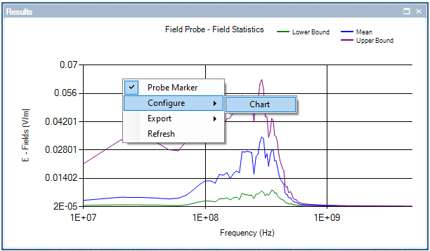
To change the plot characteristics, right click on the plot window and select Configure and then Chart.
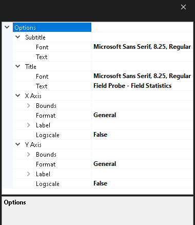
A new window with adjustable plot properties will appear. Make any changes, then close out of the pop-up window.
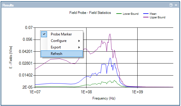
For changes to show up, users may need to right click on the plot and select Refresh.
It is possible to plot the results of multiple probes on the same plot by dragging the results of one probe from the Results node in the Simulation Tree to the desired plot within the Visualization node. Users may need to right click on the graph and hit Refresh in the pop-up menu or close the plot and reopen it to see the new plot.
Users can export either a data file or image of the field statistics.
To export a data file:
There are two ways to get to the data export window:
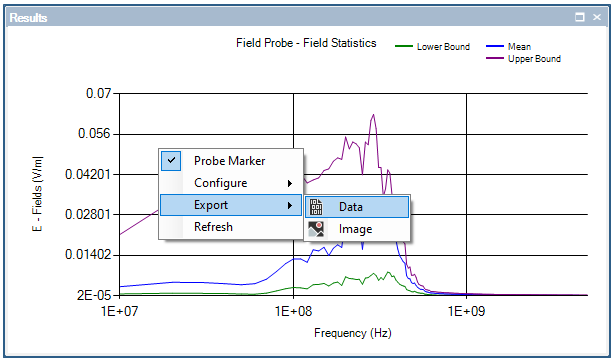
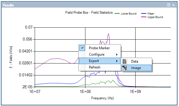
After the plots have been generated, open the desired plot to export. Right click anywhere in the graph window, select Export from the pop-up menu, then select
 Data.
Data.
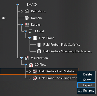
Alternatively, right click the desired plot to output from the Visualization node of the Simulation Tree and select
 Export.
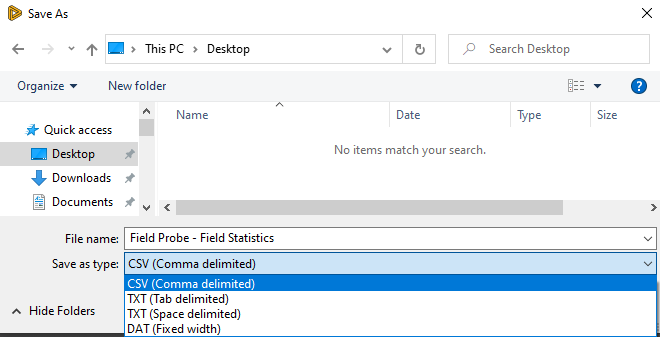
Browse to the desired save folder, name the file, and select the data file output type from the drop-down menu. Then click Save.
To export a plot image:
After the plots have been generated, open the desired plot to export.
Right click anywhere in the graph window, select Export from the pop-up menu, then select
 Image.
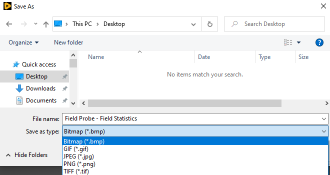
Browse to the desired save folder, name the file, and select the image output type from the drop-down menu. Then click Save.
EMA3D - © 2026 EMA, Inc. Unauthorized use, distribution, or duplication is prohibited.